For networking based on similar subscriptions interests. I worked on the app solo as designer, to decrease churn rates and simplify subscription managing.

①
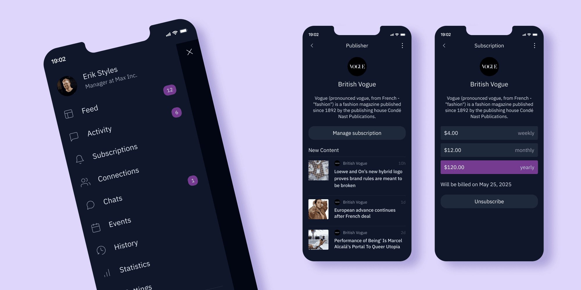
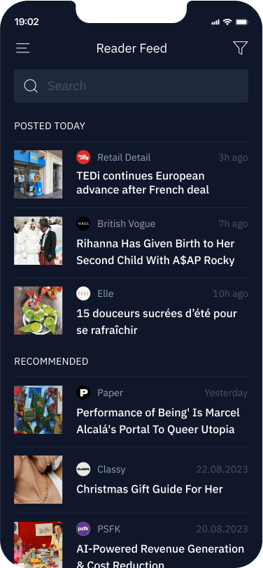
View all articles from one source.
②
Subscribe and unsubscribe in minimum taps.
③
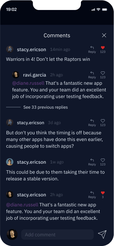
Find people with same interests as you in the comments to the articles.
④


To see clickable zones click on black sides outside the phone frame.
Churn rate = (Cancelled subscriptions in a given period / Total number of subscriptions) x 100. For example, if a business had 100 total subscriptions, and 10 of them were cancelled in a given period, the churn rate would be 10%.
①
33% of consumers have canceled at least one paid subscription in the past year, with the primary reason being: too many subscriptions.
②
This behavior of actively managing and canceling subscriptions is a clear indication of subscription fatigue, which directly contributes to higher churn rates for subscription businesses.
③
Benchmark churn rate for media and entertainment is 20%–30%.


Instead of 20 inputs to fill, like on publisher websites - we have quick login, possiblity to connect existing subscriptions and topics to choose for recommendations.

With so many options in the app, keeping them neatly in the sidebar has proven to be a working way. Each of the flows has 1-5 screens, making it easy to find needed feature.
I added social features like commenting and following to build a community. Authors get valuable insights, readers share them. Replying to a witty comment is a great way to start a conversation with a new acquaintance.

Subscribing to the publisher is often a gesture of support for quality journalism. App is showing subscribers the impact of their support to make them feel valued.

I designed for IOS in Figma. Developers later adjusted design for Android. For illustrations I used Midjourney and Recraft tools. For Desk Research and placeholder text - Perplexity.

Simplifying the onboarding process, fostering connections and showing impact of subscriptions – made it easier for users to achieve their goals, discouraging them from abandoning the app.

Churn rate in 3 months was 21%, according to Firebase + Google analytics data.
Benchmark churn rate for Media and entertainment is 20%–30%. Observations were conducted in the focus group. Each of the users had access to the app via email invitation, as a part of early access program.
1st iteration

Users did not understood that clicking on publisher’s name will open their page. I resolved this on second iteration.
2nd iteration
Users did not understood how to manage unwanted content. On next iteration I added kebab menu to each article for this.
3rd iteration

The more options we have, the longer we make a decision (Hick's Law). So I highlighted the latest, to make 4 instead of 6.

1st iteration
Like and reply often caused misclicks. Screen seemed cluttered, users avoided reading through it.
2nd iteration

Increasing space improved the situation. Small preview helps remembering what we are commenting on.
3rd iteration
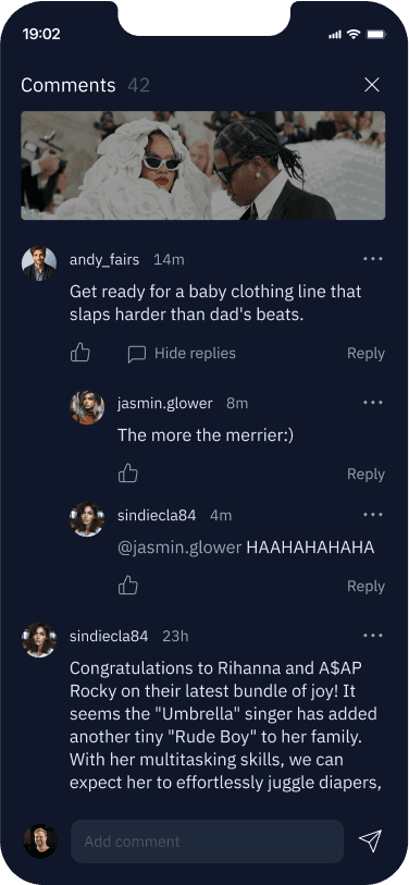
Lighter background only on the active input dragged more attention to it, while improving comment legibility.


1st iteration

Long time to click every needed month. Users tried to choose a whole year, but have not seen the possibility to do so.
2nd iteration
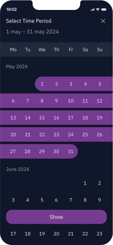
Users more often choose months as unit, not days. So this version was overdetailed and overwhelming the users.
3rd iteration
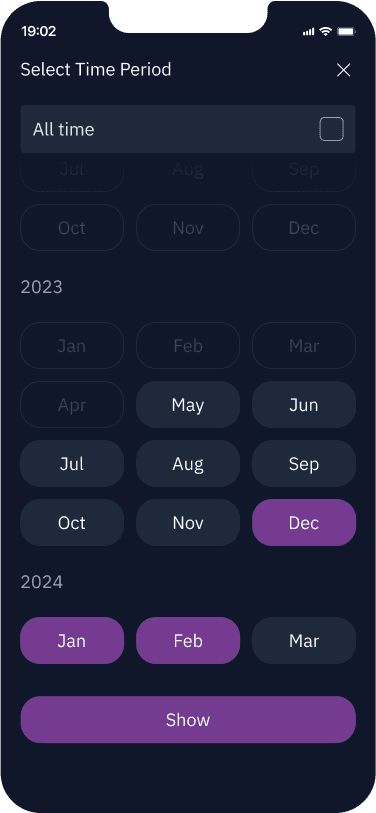
Choose time range in 2 clicks. First month, second month. Range between them activates automatically.
①
I started appreciating user feedback even more. Realised that it is okay to redo something 20 times in a row, because eventually it gets better.
②
Additionally I improved prototype animation skill, discovered some tips and tricks about working with components.
③
That was a long and joyful journey. I learned a lot about subscription businesses, by analysing user behaviour in our app and design of competitors.
Team
I worked alone as designer, side by side with developers and manager from Grandiz team.
Responsibility
UX/UI Design, Branding, UX Copywriting, User & Competitor Research, Usability Testing.
Duration
6 months
[other cases]

