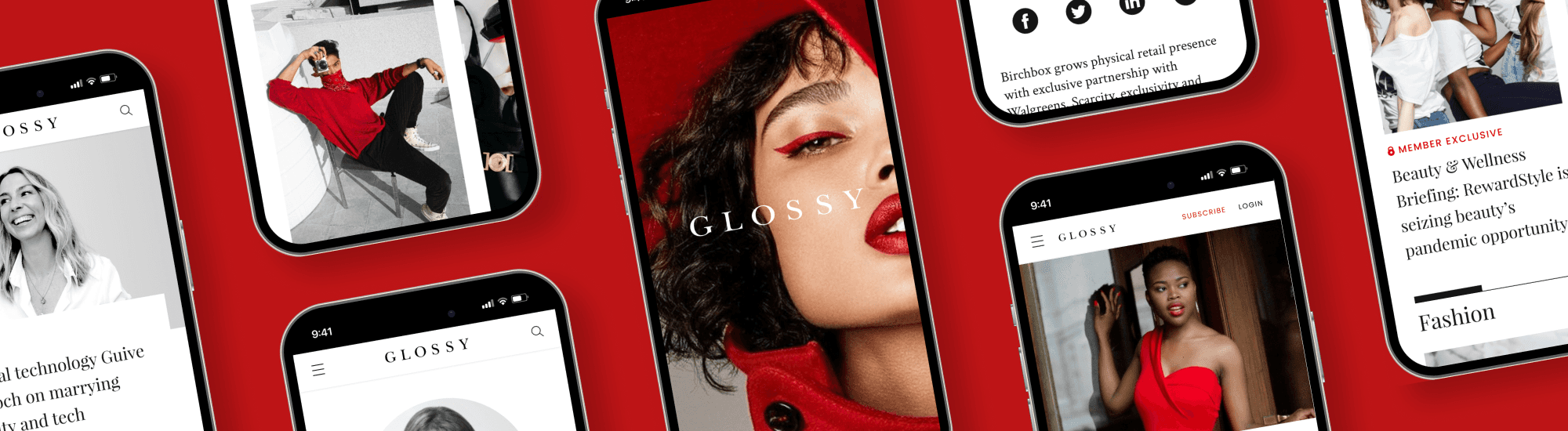
News and trend analytics for professionals in fashion industry. In the shape of articles, podcasts, videos and more. I was hired to help Glossy attract more subscribers via improved user experience.
Web
250,000 monthly users
30,000 subscribers (40% open rate)
Social
25,000 followers, 500k monthly reach
Podcasts
60,000 monthly downloads
Events
1,500 attendees per year
①
Obtrusive advertisement on free version
②
Not clear value of the subscription
③
Do not understand the difference between plans
④
Poor mobile experience
Predictable ad placements made it easier to distinguish ads from the content. Thus, making it less obtrusive and increasing the credibility of the website.
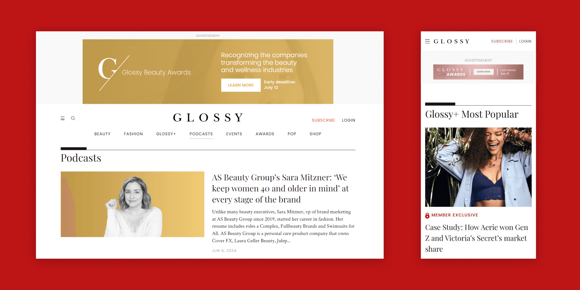
Made sure that podcast, event and shop sections look elegant and appealing to our target audience. Found a way to display them in a consistent way among the usual fashion, beauty and pop sections.

Placed strategic blocks, advertising the subscription on the main page. Put subscribe button in the sticky header, highlighted “Glossy+” category via tag.
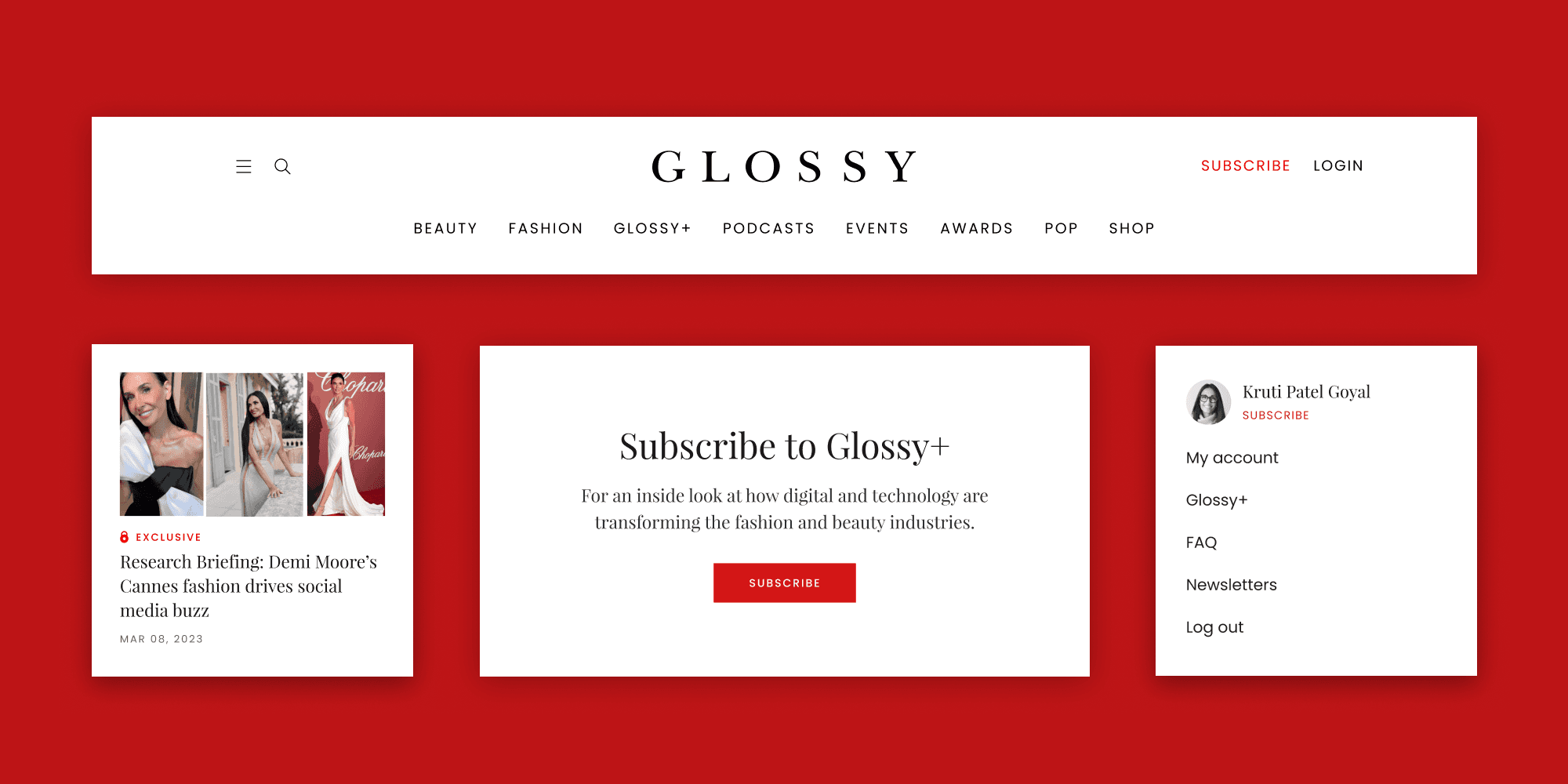
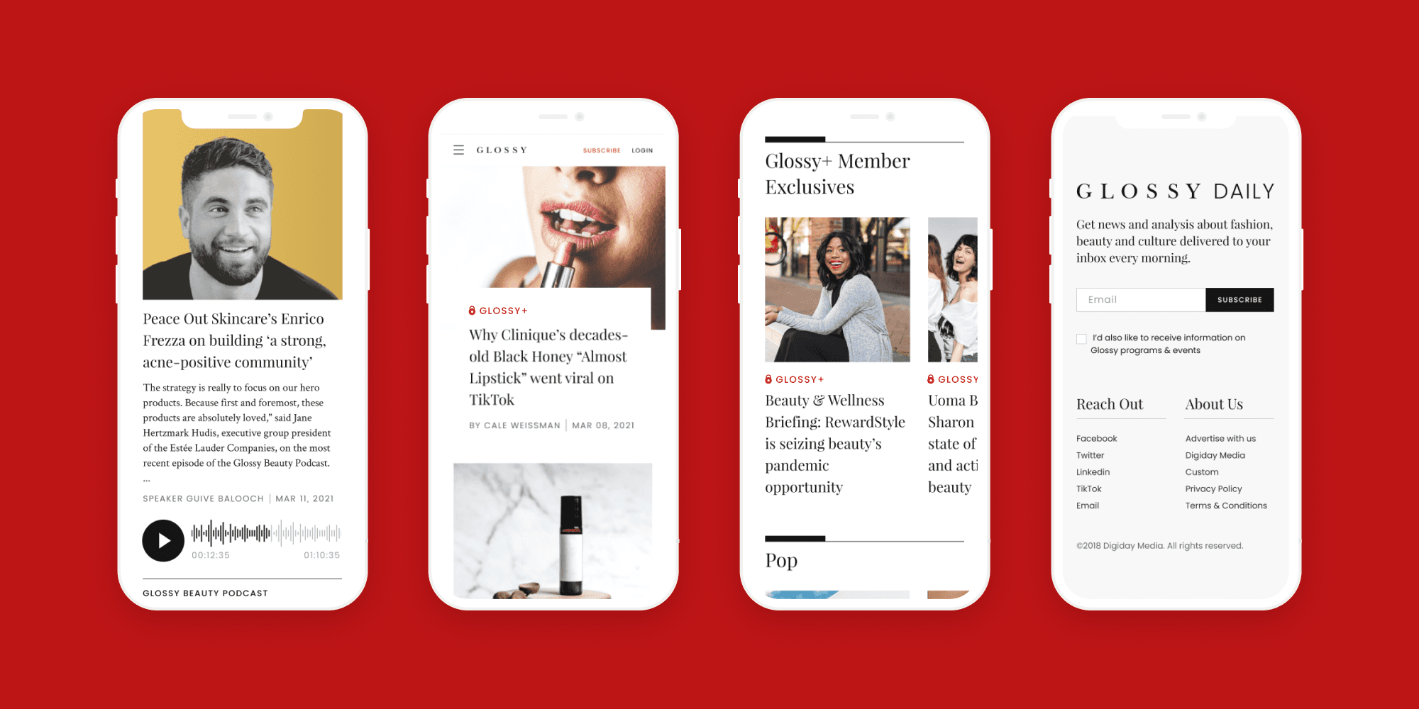
Removed repeating items from the cards, making difference between plans more clear.

Adjusted sizes and shapes of elements, to make reading comfortable from mobile.
results
Smoothing subscription flow and introducing new engaging categories – made it easier for users to achieve their goals, encouraging them to subscribe.
Subscriptions grew by 15% in next 3 months, according to Google analytics data.
takeaways
①
I learned that big projects have multiple people affecting final decision. It is easy to get a conflict when multiple people are included. But regular updates with video presentations reduce risk of it. Thus we could fix small problems, before they become big.
②
Reminding project goal in the start if presentation is vital to get helpful feedback. Otherwise people get confused about what to comment on, and get too carried away with colors and fonts.
③
Building presentation around experience helps even with style discussion. I immersed listeners in the context of interaction, and they were able to see how things would work for users. This ensured smooth collaboration process.
Team
I worked as UX/UI Designer, side by side with Brand designer and Manager from client side.
Responsibility
UX/UI Design, Mobile Adaptation.
Duration
3 months
[other cases]

