I took the initiative to redesign payment flow of the app I was using. The concept is focused on the issue with payment process and onboarding of new users.
①
20 minutes needed to make a payment, when first using the app. Most immigrants I spoke to had to ask for help, when making their first payment transfers in swiss bank.
②
Low subjective satisfaction with the payment process. Users were not certain if the payment was released or when it would be received. Pending payments were new to them.
①
Personal conversations in Telegram groups
②
Questionnaire in Google Forms, filled by 28 people
③
5 qualitative interviews in format of video conversation
Ⓒ
To avoid copyright concerns, I've hidden the original design, logo and name of the banking application. Logo is a placeholder. Case shows only UI/UX redesign.
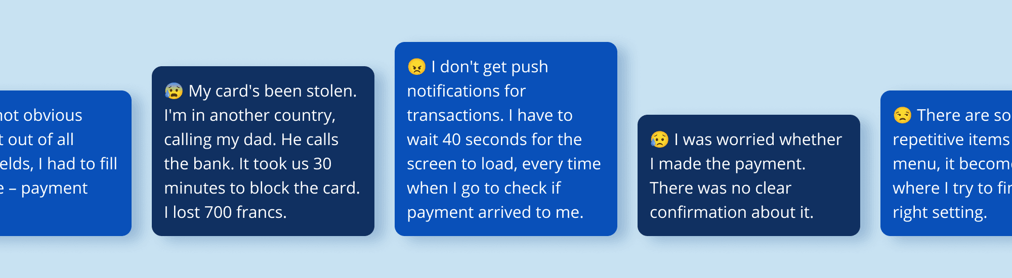
App has average rating 2.4 on App Store Reviews and 3.1 in Google Play. In reviews users complained about the following.
①
Design looking “like Windows XP” (too old)
②
Support is hard to reach
③
Usability being years behind the competition (missing features)
④
Not obvious account balance
⑤
No push notification options
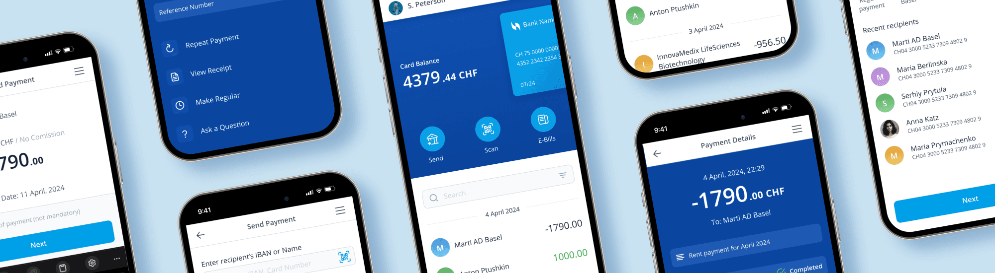
While respecting bank branding I modernized it to be more competitive. I used principles close to Material Design Guidelines, but with light strokes instead of shadows.
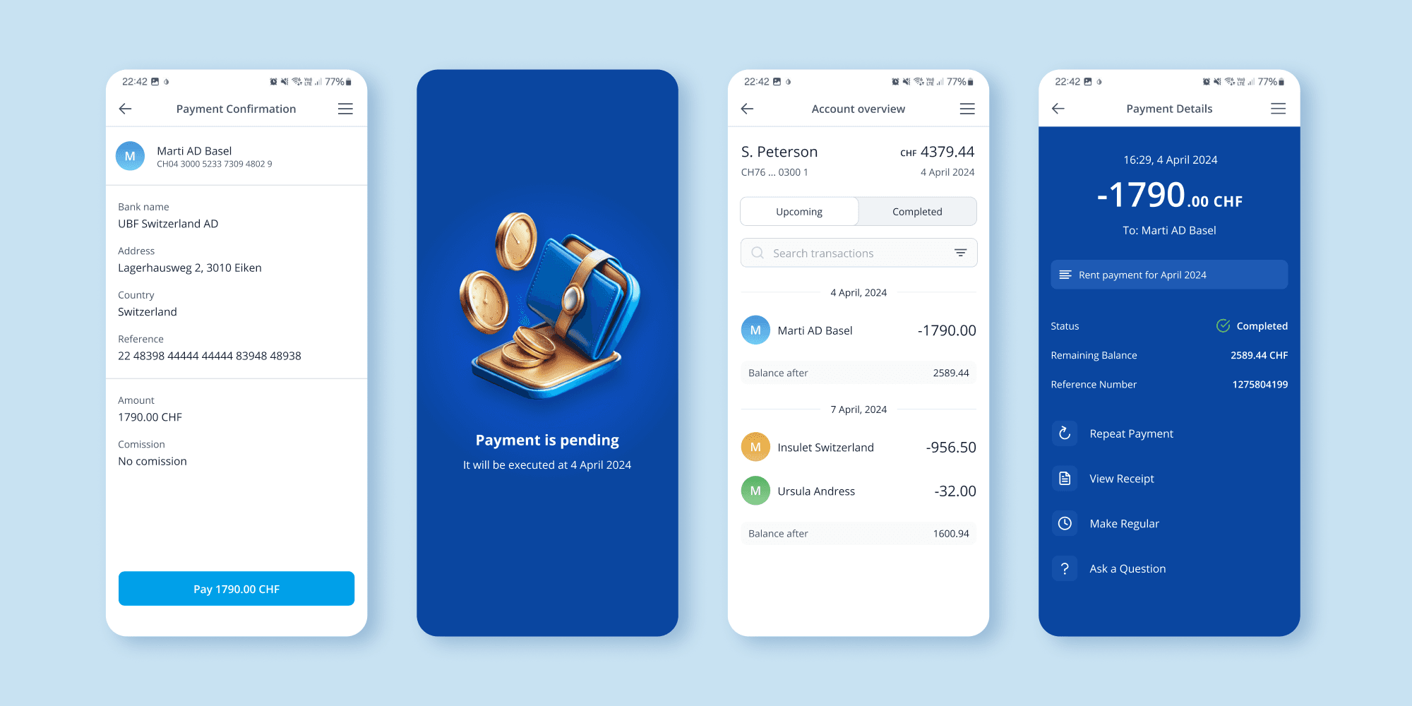
To achieve this I added common card management requests under the card visual. For some users it may save time for calls, for others - all their life savings, if the card was stolen.

I asked users what they use the app for most often, they indicated payments abroad, rent and many regular payments. So I designed a possibility to automate them.
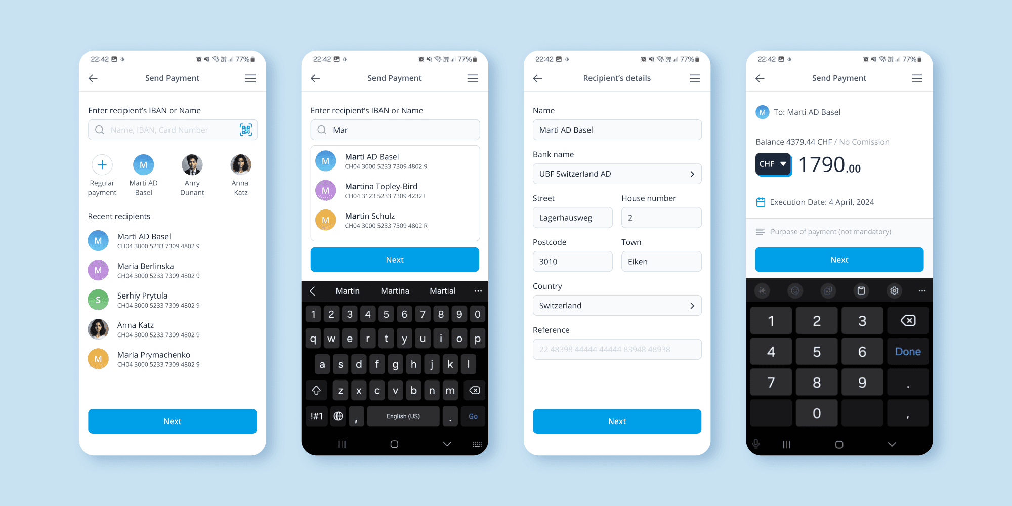
With clean hierarchy in the app, you can now see the balance instantly. While also have the access to the payment history, which was not present before.
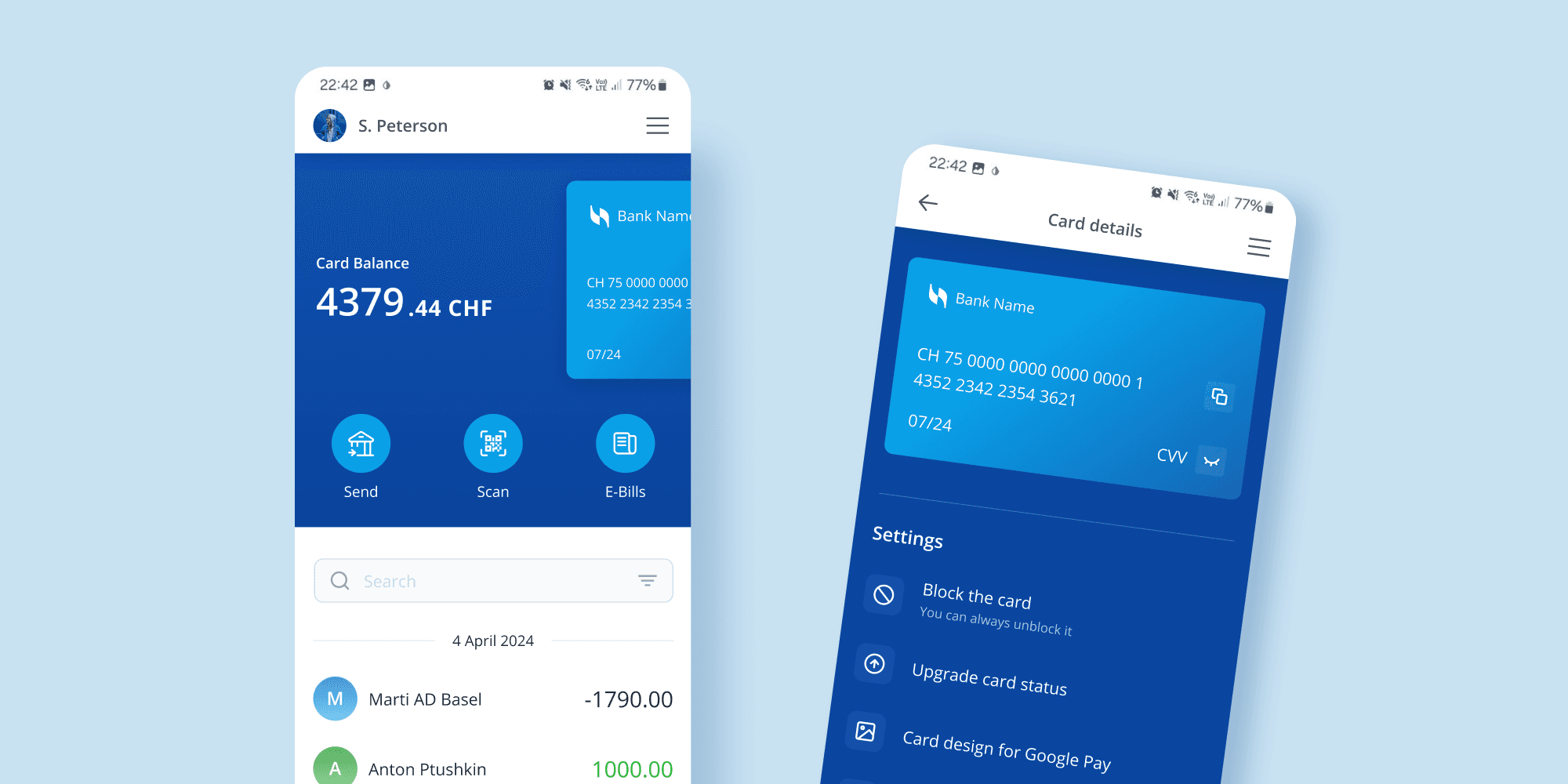
Bank could notify about the incoming and outcoming payments. So that users do not have to make unnecessary taps and wait for the app to load.

To see clickable zones click on black sides outside the phone frame.
results
BEFORE
20 min needed to make the first payment in the app
Subjective satisfaction with payment process – 1.7⭐️
AFTER
5 min needed to make the first payment in the app
Subjective satisfaction with payment process – 4.5⭐️
ⓘ
Based on responses from 28 people in Google Forms questionnaires.
takeaways
①
I learned a lot about banking UX best practices, using researches in the Fintech niche.
②
Met great people, heard their stories during interviews. Realised how much of the stress it can create, when people have issues with money related interfaces.
③
Banks have many limits, that need to be considered when designing. But that does not mean payments can’t be simple.
Team
I worked alone on this project, since I wanted to explore the design of the app I was using. This is not a commercial project.
Responsibility
UX/UI Design, UX Copywriting, User & Competitor Research, Usability Testing.
Duration
4 weeks
[other cases]

